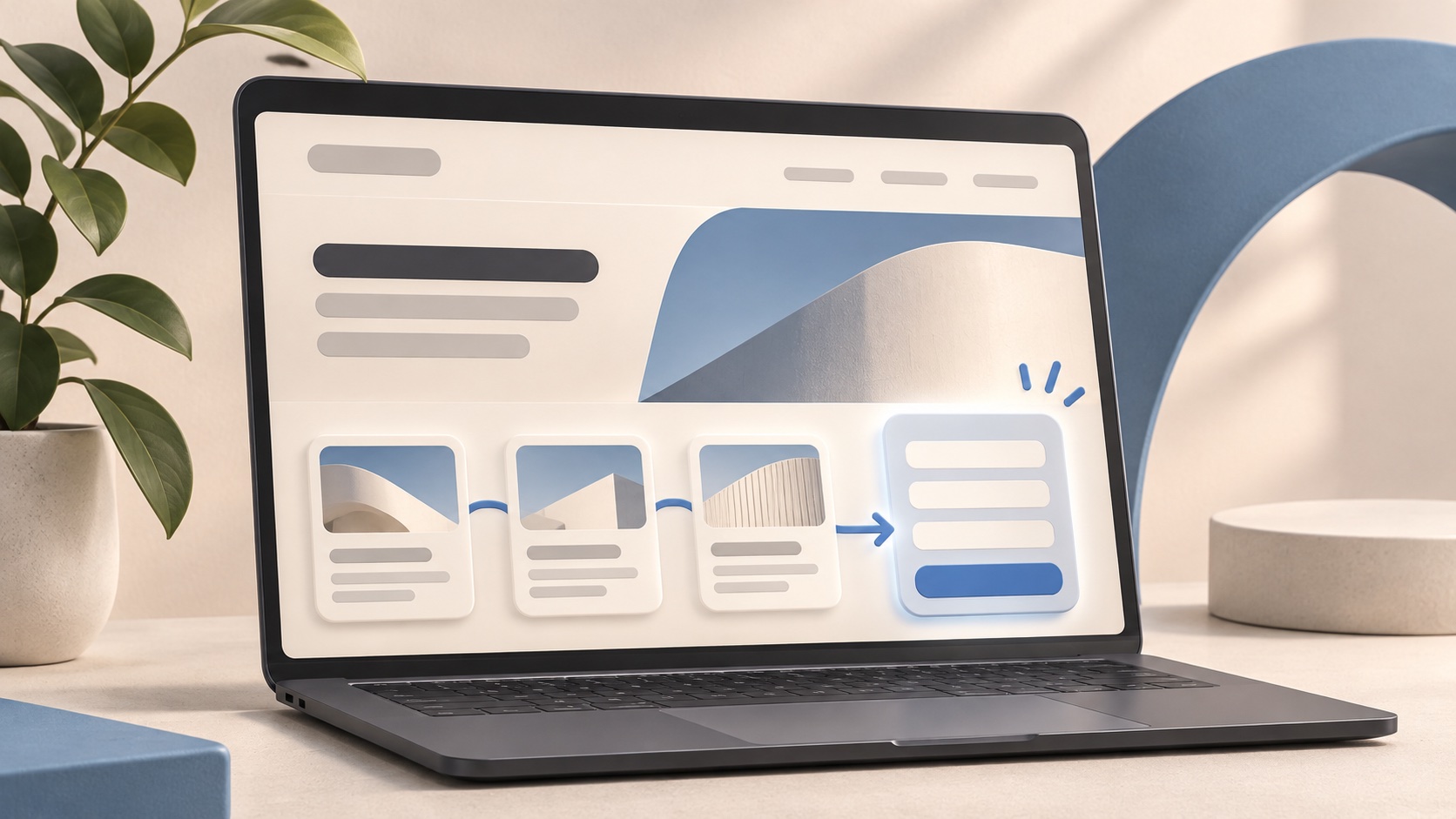
Make the next step obvious
A visitor arrives with a question: Can this business solve my problem? A useful website answers it quickly. State who you help, what you provide, and what to do next near the top of each key page. Keep the message specific enough that the right customer recognizes their situation.
A call to action should match the stage of the visit. Someone comparing services may want to view examples, while someone ready to act may want a quote or consultation. Give both routes clear labels instead of relying on a vague button.
Reduce friction in navigation and content
Use familiar menu names and group related information together. Service pages should explain the problem, the approach, expected deliverables, and what happens after an enquiry. Short paragraphs, descriptive headings, and readable contrast help people scan on any screen.
Avoid making visitors repeat work. If an ad or search result promises a specific service, send them to the relevant page. Make pricing or the factors that affect it clear when possible. Answer common objections before the contact form.
Build trust where decisions happen
People look for evidence before sharing their details. Relevant project examples, testimonials, process explanations, and real contact information can help them judge whether you are a fit. Place proof close to the service or offer it supports, rather than burying it on a separate page.
Be precise about claims. Show what the team actually did, what the client needed, and what can be verified. Honest detail is more useful than generic promises of outstanding results.
Questions about website UX
What counts as a conversion? It is the action your business wants, such as a relevant enquiry, booking, or purchase. Define it before changing a page so you can judge whether the change helped.
Where should you start? Review the pages people reach most often and complete a real customer journey on a phone. Fix confusing messages, broken interactions, and difficult forms before adding decorative elements.
Make contact easy and measure the journey
Ask only for the information needed to start a conversation. Label fields clearly, show validation help, and explain what happens after submission. On mobile, test the form with a real phone and make tap targets comfortable.
After launch, review where visitors leave, which pages produce enquiries, and what customers ask when they contact you. Improve one friction point at a time and test the result. Loop combines UI/UX design and web development to build websites that are clear, useful, and aligned with business goals. Discuss your project at https://loop.md/en#contact.